作为插件单独使用
引用下面CSS:
<link rel="stylesheet" href="https://qidian.gtimg.com/lulu/pure/css/common/ui/Color.css">
JS为:
<script src="https://qidian.gtimg.com/lulu/pure/js/common/ui/Follow.js"></script>
<script src="https://qidian.gtimg.com/lulu/pure/js/common/ui/Drop.js"></script>
<script src="https://qidian.gtimg.com/lulu/pure/js/common/ui/Color.js"></script>
或者使用合并地址:
<script src="https://qidian.gtimg.com/c/=/lulu/pure/js/common/ui/Follow.js,/lulu/pure/js/common/ui/Drop.js,/lulu/pure/js/common/ui/Color.js"></script>
基础使用示意
基于 HTML5 type="color" 区域选择框实现的颜色选择组件。
基本使用示意
颜色为:
无需任何初始化,只要输入框的 type 类型为 color 就可以了,如下示意:
<input type="color" class="ui-color-input">
默认颜色为纯黑色。
指定初始颜色
我们也可以指定初始 value 颜色值,使用 #RRGGBB 格式,例如,初始颜色为红色,则代码如下:
<input type="color" class="ui-color-input" value="#ff0000">
效果为:
颜色变化事件
直接给 type='color' 输入框绑定原生的 'change' 事件就可以了。
例如“基本使用示意”那里标题跟着变色的 JS 代码为:
input.addEventListener('change', function () {
    title.style.color = this.value;
});
使用原生时间选择器
设置 is-visible 属性即可。
原始 UI:
<input type="color" is-visible>
在 IE 浏览器下会表现为普通输入框。
深入应用示意
动态颜色赋值
如果在颜色选择器已经完成初始化之后,想要使用 JavaScript 代码修改显示的颜色,则可以使用实例对象暴露的 value() 方法。例如:
HTML和JS代码如下:
<input type="color" id="input" class="ui-color-input">
<button id="button">变成红色</button>
// 点击按钮
button.addEventListener('click', function () {
    // 设置为红色
    // input.data.color就是存储在输入框DOM元素对象上的实例方法
    input.data.color.value('#ff0000');
});
本 Color 组件也支持颜色关键字赋值,例如:
HTML 和 JS 代码如下:
<input type="color" id="input2" class="ui-color-input">
<button id="button2">变成mediumseagreen</button>
// 点击按钮
button2.addEventListener('click', function () {
    // 设置为中海绿色
    input2.data.color.value('mediumseagreen');
});
动态插入删除
<button class="ui-button" id="bi" data-type="primary">点击插入</button>
<button class="ui-button" id="br" data-type="danger">点击删除</button>
bi.addEventListener('click', function () {
    this.insertAdjacentHTML('afterend', '<p><input type="color"></p>');
});
br.addEventListener('click', function () {
    var prev = this.previousElementSibling;
    if (prev.matches('p')) {
        prev.remove();
    }
});
语法和参数
语法如下:
var myColor = new Color(element, options);
其中:
- element
- 必需。Element 元素对象或者 String 元素选择器。
- options
- 可选。Object 纯对象。支持可选参数见下表:
| 参数名称 | 支持类型 | 默认值 | 释义 |
|---|---|---|---|
| offsets | Object | { x: 0, y: 0 } |
表示浮动元素的偏移大小,相对于右上角偏移,数值越大右上角偏移越大。 |
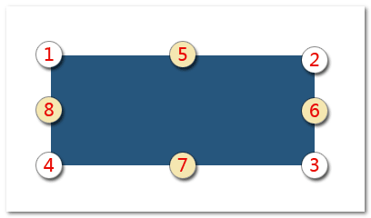
| position | String | '7-5' | 表示触发元素和浮层元素的定位关系。'trigger-target'规则,数字表示对应元素的位置,具体如下图。例如'7-5'就表示触发元素的位置7个浮层元素的5对齐。
|
| edgeAdjust | Boolean | false | 表示浮层屏幕之外的时候,是否自动调整方向。默认是不自动调整。 |
| onShow | Function | function () {} | 浮层显示时候的回调方法。函数的上下文this为当前实例对象,支持两个参数,第一个参数为触发元素,第二个参数为浮层元素。 |
| onHide | Function | function () {} | 浮层隐藏时候的回调方法。函数的上下文this为当前实例对象,支持两个参数,第一个参数为触发元素,第二个参数为浮层元素。 |
本组件依赖 Drop.js 组件。
关于实例对象
myColor 就是返回的实例对象,暴露了以下属性和方法:
{
    element: {
        // 输入框
        input: null,
        // 面板容器
        container: null,
        // 创建的色块元素
        track: null,
        thumb: null,
        // 面板显示之后同时包含下面这些
        field: null,
        basic: null,
        // 面板中“更多”切换按钮元素
        more: null,
        // 面板中色域取色操作元素们
        circle: null,
        fill: null,,
        arrow: null,
        // 面板中色值输入框元素
        current: null
    },
    params: {
        offsets: {},
        edgeAdjust: false,
        position: '7-5'
    };
    callback: {
        show: function () {},
        hide: function () {}
    },
    display: true/false,
    // Drop实例
    drop: new Drop(),
    // 赋值以及UI同步
    value: function(value) {},
    // 显示并定位
    show: function() {},
    // 隐藏
    hide: function() {},
    ...
}
本组件由于默认就执行,因为没有调用 new Color() 方法的机会,此时 myColor 可以通过输入框元素获取。假设输入框元素 DOM 对象是 input,则此时 myColor 可以使用下面方法获取:
myColor = input.data.color;
本页贡献者:
zhangxinxu